January 31, 2012

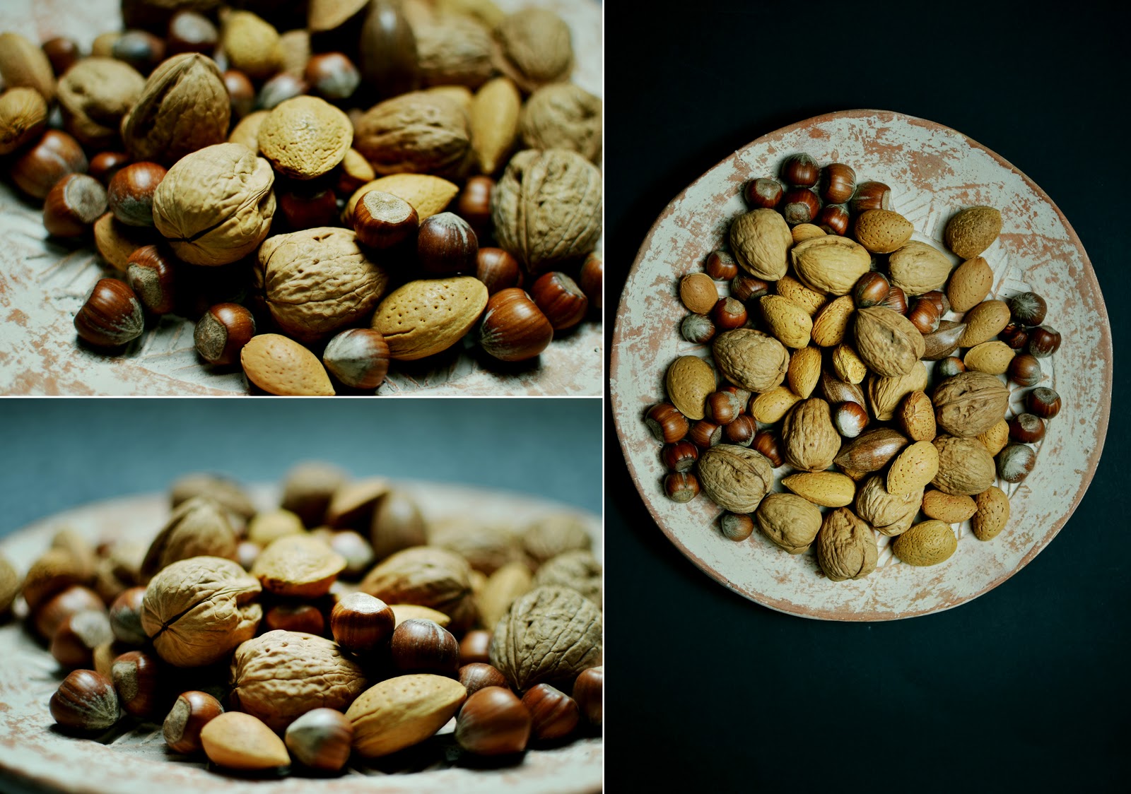
From a chef’s table to molecular food

LAB' GUEST COLUMN_ Irina Fratila_ photographer                                                        
 
© irina fratila
''....elegantly introducing a pinch to a hip audience or going through a string of art-concepts, food as raw material for communication in its modern meaning has only really gained attraction recently. Emulating the nowadays trends in art into food business, may be one of the most intimate form of exciting our brain as one basic need is pulled through-out the upper layers of humanity, wrapped with design and appealing to the thought and senses rather to the physic. 
An indefinite number of visions arguing on the same ancestral need for food. Maslow would have never thought of this.''    
(Irina Frățilă, photographer)        
© irina fratila
LAB' GUEST COLUMN_ Irina Fratila_ photographer                                                                                                                         Irina Frățilă is a naval architect with passion for photography. You can find out more about her work as a photographer visiting her portfolio on: http://www.behance.net/irinafratila or visting the following food and lifestyle photography related blogs that inspire her:  http://www.jamesransom.com/, http://www.cannellevanille.com/, http://lingeredupon.blogspot.com/, http://www.79ideas.org/, http://www.islandmenu.com.au/

January 30, 2012

WHAT?Wow!..WHAT?


The beauty and intriguing aspect of hybrid structures in architecture will always be an interesting  topic of debate and observation, especially when such structures are based on logic, careful observation of the society needs and knowledge...

Beautiful and inspiring video about how normality can be reshaped and reinterpreted to finally get an interesting, practical, sometimes humorous and unexpected result...

January 27, 2012

IFFR 2012!

                                                                  © and source: http://www.filmfestivalrotterdam.com/nl/


It is almost weekend and one of the most important cultural events of 2012 in the Rotterdam area, has already started since two days: The International Film Festival Rotterdam.-Wide range of interesting movies, lots of them already completely booked in the first day, but still plenty of choices for a cultural weekend! 

Check the trailers and enjoy the viewing if you are around  Rotterdam http://trailers.filmfestivalrotterdam.com/, otherwise we already wish you great weekend!

P.S.We will come back with more feedback from this event soon, so do not forget to check our guest column!

January 24, 2012

THE TRIANGLE HOUSE

 LAB' GUEST COLUMN _ bozin szekely architects _ THE TRIANGLE HOUSE                       

©   bozin szekely architects 


©   bozin szekely architects  

''The first thing we draw was a blind wall aligned to the street, as a response to the high level of privacy requested by our client. To reinforce the idea of privacy we chose this triangular shape that makes the house disappear behind the wall. It is also the only shape that allowed the sunlight to enter the whole house.

The ground floor contains a private space isolated from the rest of the house, a studio; and the upper floor needs to capture light for the bedrooms, a common space. We use these two elements as space generators. The open space from the ground floor is organised by the solid cylindrical volume of the studio. On the upper floor we extract the same cylindrical volume to generate the terrace that captures the morning light and brings it in our bedrooms.''(bozin szekely architects)


©   bozin szekely architects   
  LAB' GUEST COLUMN  _  bozin szekely architects  _  THE TRIANGLE HOUSE                                             

bozin szekely architects is a young architectural office based in Romania. The two partners studied and worked in Romania, France and Switzerland and collaborated with important offices in the architectural field. Find out more about their work at   http://bozinszekely.com .

January 20, 2012

Coming soon: THE GUEST COLUMN!


LAB' GUEST COLUMN                                                                                                        

Before the New Year we were speaking about new projects for our Blog. The time for launching one of this year’s blog projects has arrived! Starting from the coming week, we will have a new section on our blog called GUEST COLUMN, a section where we will invite friends to write about their creative projects and interests.
The first guest column will be published next Tuesday. Don't forget to check The Lab' next week!


January 18, 2012

Product development/ 2-way necklace


Prototyping is a necessary step of product development. In a world of Computer-aided design (CAD) and 3D image exports, nothing can yet replace a prototype when it comes to items meant to be worn. It helps to test the product and to identify problems you may not have been aware of otherwise. It is an interactive cycle made of testing, analyzing, redefining, recreating, starting all over again... And some prototypes make it more difficult than others…

We've been working on a specific prototype for some time now: the 2-way necklace – a necklace with a concrete pendant that can be worn two ways. Some of you might have already seen it in our first collection preview. The outlines of the design should remain the same although we work to improve the closing system. It takes time but we are making every effort to bring out the final product soon.

Since this is one of our favorite items, we hope that the 2-way concrete necklace will soon be available in our shop! Follow us and we will surely let you know about the development.


January 13, 2012

Another website philosophy…


We have been starting the year with a new website organization and a slight change of look for a better understanding of our project. Navigation logic follows now better our design philosophy which aims, in the first place, to create a better link between the fields where our items find applications. 


Enjoy the visit and have a nice weekend!

January 9, 2012

It’s time for new calendars…


 source and © pictures : http://www.dagandesign.com


MOMA, first class contemporary art museum, also manufactures great design products. A visit to the MOMA store – in person or through the Internet –always makes you discover great design items such as the Perpetual Calendar created by Gideon Dagan in 1998.

This Perpetual calendar captures the essence of pure and minimalist function.

“Designed for the Museum of Modern Art, NY, this unique calendar can be used year after year thus making it an Eco-conscious product. The calendar placed on a desktop, or mounted on a wall, its string-tethered seemingly gravity-defying ball is suspended in mid-air, and manually moved to mark each month. A second ball on the horizontal beam indicates the day. Constructed of injected-molded ABS recyclable polymer and magnets.”

The new small version, designed in 2008, commemorates the 10th anniversary of the original design.

In short, there are only good reasons to fall for this perpetual calendar...


 source and © pictures : http://www.dagandesign.com


December 31, 2011

OLD AND NEW


Here we are - the end of 2011 and the beginning of 2012! Time to count the accomplishments of a year, draw a line , make a conclusion and start a list for the year to come! 
 
2011 was an incredible year for us - we started Lab'process, worked on and launched the website and the blog, created new products! It was a year filled with accomplishments and difficult steps on the way. But we did it and we are happy with the result! 

 
What to wish for 2012? We will continue our journey and experiments in our Lab', so we only wish for more readers and clients ;)… And of course, lots of successful experiments!

We are already working on new interesting projects so follow us in 2012 as well :)!

Until then, we wish you all a wonderful new year and a great party tonight!!!!


December 24, 2011

Merry Christmas to you all!

We wish you all a Merry Christmas wherever you are. There might be either snow or a lot of sun depending where you are but, in any case, this time of the year is favourable to meetings with family and friends. We wish you enjoy these special moments, just as we will…

So again, a merry Christmas and a happy end of the year 2011…

December 20, 2011

Concrete and architecture


       © Suppose design office -source http://www.suppose.jp/works/category/house/, Project: Hiroshima 05.2007     


We love Japanese Architecture and design- who doesn't? It is straight-forward, simple, most of the times introverted and intriguing, has impeccable details and mostly it plays with concrete...

Japan will remain and endless source of inspiration and admiration for us.

Tadao Ando, Toyo Ito, Saana ...just few great names and so many incredible designs...

But today we want to write about a younger, a bit less famous Japanese architectural office: Suppose design office. We love most of their housing projects with their playfulness,incredible association of materials and of course, the usage of concrete...  


    © Suppose design office- source   http://www.suppose.jp/works/category/house/,  Project: Hiroshima 05.2007

December 13, 2011

IN THE LAB'...


We are still experimenting in our lab’ and working on creating new products…But we think there are already steps that can be interesting to share… 

We think that what we are experimenting today is one of the most interesting experiments we tried in our Lab'. From the process and innovation point of view, everything is unconventional:  the combination of materials, the techniques to the final product. But what we really appreciate is the freedom it gives us in the creative process…


December 9, 2011

15 Days to Christmas!


Christmas is getting closer and so is the rush for finding gifts.

Gifts come in all kinds of boxes but how important is the look of the package itself? -Pretty important if you ask us. 

These days we've been cutting, folding, wrapping packages with one idea in mind: great wrapping makes the present complete. So did you find all your gifts yet? Have a look at our website to find gift ideas. We will make sure your choices come in the perfect package.


December 6, 2011

A PALETTE OF TASTES AND COLORS…

                                                                                                             source and © pictures : www.chocolate-only.com


Sadaharu Aoki, worldwide famous pastry chef, created the most exquisite chocolates: a real palette of tastes and colors and a fusion of French pastry and Japanese culinary culture… It could only get our attention. 

The “rainbow chocolates” reflect the constant search for simplicity and minimalism of Sadaharu Aoki for who colors are capital ingredients; “I like to create simple things, but it is the most difficult thing to do, since simple things cannot be manipulated” - Sadaharu Aoki. 

At the moment a special chocolate box called “Au nom du Chocolat” is available. Sadaharu Aoki and five other chocolate creators combined their talents in favor of the Humanitarian Association "Toutes à l’Ecole” and its action for the education of young girls in Cambodia. 

A beautiful and delicious Christmas gift idea for a good cause!


                                                                                                      source and © pictures : www.chocolate-only.com

December 1, 2011

'Fashion is architecture: it is a matter of proportions.'


'Fashion is architecture: it is a matter of proportions.'-Coco Chanel. 


We would also say : everything in design is a matter of proportions... 

This is the story of our first clutch model. ..yellow and black..We haven't baptized it yet...any suggestions for a name? 

It all started from the desire of creating a fashion accessory with architectural proportions...We wanted a fashionable clutch, but in the same time very minimal, with interesting proportions and an original way of closing.We were also looking for a material that wouldn't 'run', was thick enough to give the object a good shape and an interesting texture. That is why we choose felt. To make things even more interesting we chose to work with the most contrasting colors: black and yellow. The rest was only a matter of folding and playing with proportions...and of course using the magical number 3!...


   Note: pictures above were taken in December 2010 of the first prototype

November 28, 2011

Red, architecture and food design


© Frigor Carrés (image: AJN), source http://www.an-architecture.com


...Continuing the research about colors and their application in design..Today- colors in Jean Nouvel's designs-2005 packaging competition for the chocolate brand Callier and The Serpentine Gallery Pavilion in London-two designs with application in different fields but linked by the same gesture: 100% red.


November 24, 2011

Who’s afraid of red, yellow and blue?

  Extract; Low resolution, fair use image of
 ''Who's Afraid of Red, Yellow and Blue?'', 1966, by Barnett Newman. 
Oil on canvas, source Wikipedia

Did you ever wonder why all the designers have a preference for black and grey shades? It doesn't matter if is about what they create or what they dress but neutral and dark shades are most of the time present …Yes, black is a symbol of elegance, nobility and minimalism … but are these the only reasons for giving black such an important role? 

We do love black and grey tones; we use them a lot in our designs and daily life but still try to discover more about the other colors and integrate them as much in our designs, but somehow it becomes a more complex task... 

So many things had been told about colors and design; there were so many studies done about the significance of every color and how colors should be used in order to create the atmosphere, effect or just to send the message we want. The truth is, after all, colors and their application in design will remain very subjective. It is a matter of personal perception, cultural background and even a matter of mood. 

As designers we are still interested to address our products to a wide range of people and get the effect we want, so the question about how, when, which and in what proportion shall we use the colors will always be an actual subject of debate…

So, as Barnett Newman series of paintings asks: who's afraid of red, yellow and blue?

November 18, 2011

THE CUBE


Lab’process project was started at the end of summer 2010. And there is one product (that you may already have discovered on our website) that marks somehow the beginning of our collaboration: the model of concrete lamp called the CUBE.

We already spoke about our interest for concrete and how fascinating this material is for us. We love its simplicity and complexity in the same time, the range of different textures it can get, the shades and all the variety of shapes we can create with it. So is not a coincidence that our first product was made of concrete.

The CUBE has a unique story since it was designed to ‘accessorize’ the house of one of us. The need was for a lamp that could be used both as a floor lamp and on the bedside, that could fit more than just one setting and could create a nice atmosphere for the long, grey rainy Dutch days; one simple yet interesting object with multiple uses –lots of requirements not easy to find in an object after a quick scan of what is available on the market.

Having a pretty clear idea of the design in mind, we thought it was worth giving it a shot and so, to create the object exactly how we wanted it to be: simple, at the right dimensions to fit multiple use, neutral material and color, providing diffuse light that reflects on a rough surface, creating a multitude of shades…

That was sort of the beginning of Lab’... Back then we were already speaking of joining our professional experiences and try to bring our ideas under one structure but we were still thinking how and in which form. The CUBE gave us somehow a direction. It was our first successful experiment and probably the item that really helped us decide to start what is now Lab’process...


November 11, 2011

Paris, Les Journées Particulières and Christian Dior Haute Couture….


                                                                                                                                        ©  Dior website


Last month we spent an incredible week-end in Paris- 3 days of gastronomic highlights, culture, design, great architecture and a visit to Dior's ateliers. 

There are so many stories about the interesting things that we have seen and done in just 3 days, but today we shall tell more about the ‘Les Journées Particulières’ event and our fabulous visit to les salons Haute Couture de Christian Dior. 

This year for the very first time, the luxury conglomerate LVMH had organized a special event - “Les Journées Particulières” – offering the public demonstrations and intimate tours of 25 houses of history, creation, exceptional savoir-faire and tradition of excellence.

On October 16th, we got the chance to visit the traditionally off-limits Haute-Couture Salons of Christian Dior at 30 avenues Montaigne. This emblematic house is where Christian Dior founded his label in 1947 and showed his first collection in 1947 - an event that was attended by Marlene Dietrich, Rita Hayworth and Jean Cocteau...

Christian Dior went down in fashion history as the inventor of the "New Look" in 1946, a revolutionary style that influenced fashion and other designers for many years. What we find fascinating about Dior is the visionary concept of what has become a true empire. Christian Dior would never define himself as a simple fashion designer. He thought that there were several ways to magnify a silhouette and, above all, that they could complement each other without opposing. For him, perfume was for example "the indispensable complement of the female personality, the finishing touch to a dress".

Our visit consisted in a tour of the Dior ateliers in the heart of Avenue Montaigne- one and a half hour of elegance, outstanding techniques and incredible crafting traditions to produce items for one of the most appreciated fashion brands. It was just as we expected and more..From the suits line for men, to the jewelries, perfume, shoes, bags and the iconic Dior Bar suit, every item is designed, studied and adjust until it reaches ‘perfection’- an incredible process which makes a great lesson for any designer….


'Structure, surface and feminine silhouette are cultivated at the house of Dior for Autumn/Winter 2011-12 to capture the spirit of la Rose Moderne.Architectural exactitude inspires new cut and construction to bloom, as fabric techniques are innovated by the studio to create an elegant new Haute Couture.
………….. 
Frank Gehry inspires shimmering soft metallics with glass sequins, neutrals and a new Dior rose. Modern waves are constructed in light mille feuille forms of natural beauty, frayed iridescent lamé and muted taffetas. Metallic embroidery, circular layering and light deconstruction twist a new Dior Gehry rose of pure elegance.'
( Dior website- autumn-winter collection 2011 )