March 21, 2012

DESIGN TIME!


Not long ago we were speaking about how items, such as the glasses, can contribute to completing ones image and be more than just a fashionable accessory. Today we want to speak about another type of item who has similar characteristics, as it was created to meet a practical need and became quickly a fashion accessory and an interesting subject of research for many designers: the watch.

The first model of watch, for example, designed by Martin Larsen for the Danish Design brand, has been awarded in 2008 with the Red Dot for its good design.‘’This innovative range of watches follows the tradition of Danish design and is an expression of a modern stylistic language. The intention is to refine Danish design in these watches and to create simple but sculptural timekeepers. Mainly strict forms, as can be found in geometry, inspired the designer Martin Larsen. Another incentive was the search for the "essential" in the structures and the materials used.’’(http:/ /www.danishdesignwatches.eu/index.php_)

For us, is just a great, minimalistic design, that somehow manages to capture in simple lines and gestures the essence of a traditional watch: rounded shapes, simple dots instead of numbers and just a drop of red for the seconds’ hand.


Designer Martin Larsen source picture : http://www.horloge.info 


A bit less conventional, the other models are just as great.We love the simplicity and yet their sculptural and innovative aspect by drawing ‘’the time with strict irrationality breaking up once again the rules of the traditional reading of the time..’’(http://www.dezeen.com/2010/04/07/time-lines-by-denis-guidone-for-nava/ ) or by pointing out the hour with three simple dots.
Designer Denis Guidone, source picture : http://www.dezeenwatchstore.com 
Designer Denis Guidone for Nava, source picture : http://www.dezeen.com/2010/04/07/time-lines-by-denis-guidone-for-nava/ 


And finally, for more futuristic tastes, the bracelet watch by  Djordje Zivanovic.‘’The idea for this watch is classic plastic bracelet, with incorporated lines inside the watch that show the current time. Those three line are rotating around the watch and show the time, while the seconds line is going around all the time. One line for hour,second for minute and third for seconds,and three different colors for every lines. It`s simple concept, attractive and eye catching. ’’ (Djordje Zivanovic ,http://www.behance.net/Gallery/ORB-Bracelet-Watch/88527 )


Designer  Djordje Zivanovic ,source http://www.behance.net/Gallery/ORB-Bracelet-Watch/88527 

March 16, 2012

Griottes' culinary palette...


source picture:http://www.apartmenttherapy.com/pantone-mugs-br-124871 


Many of you know ‘Pantone’ either as a working tool - Pantone Inc. is THE authority on color with its famous Pantone swatch book - or because you came across one of these by-products recently.

Did you ever find yourself standing in front of a wall of mugs picking your favorite color?

That is what French food designer Emilie de Griottes invites you to do with her special project entitled “Choose your color”. Emilie recreated the Pantone colour swatch book using fruit, vegetable, candies and other food ingredients to create colourful pies that will star in the next issue of culinary magazine Fricote. 

Playing with the color of food is one of her specialty. Going further with our research on the relationship between food and color and its effect on us, our eyes stopped on these very graphical and appealing visuals. 

Congratulations Emily and thank you for sharing these pictures on our blog.

So now it is your turn to choose a pantone color according to your desire and your mood of the moment. What pie would you choose?


credits pictures :  Griottes  : www.griottes.fr for the magazine Fricote

March 13, 2012

Möbius strip, architecture and fashion


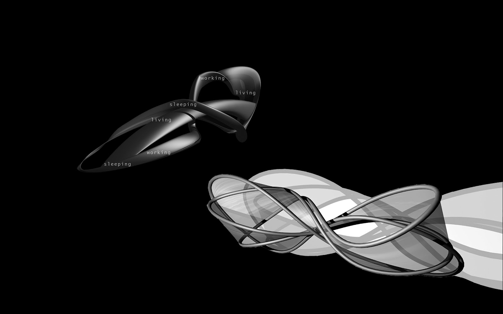
The Mobius strip has been a constant source of inspiration and fascination for mathematicians and architects as it is a non-orientable surface with only one continuous side and one continuous edge. 

Most of us are familiar with the concept and one its most famous application in architecture: the UNStudio Mobius house built-up in the Netherlands, where ‘’ the intertwining trajectory of the loop relates to the 24-hour living and working cycle of the family, where individual working spaces and bedrooms are aligned but collective areas are situated at the crossing points of the paths. ’’ (source: http://www.unstudio.com/projects/mobius-house).


Recently we discovered another application of this beautiful surface, this time in fashion, under the shape of an interesting dress. The two designers of the Mobius dress, both architects, wanted to challenge through this project, ‘’the clothing’s absolute adherence to conventions of interiority and exteriority’’ by proposing an inside-out and outside in garment. Using the Möbius strip properties of non orientation, single sided and single edged surface, the designers managed to create a fashion item structured only by the body where the material used has no hierarchy. ‘’Applied to the body, the spatial loop creates the appearance of two intertwining bands of fabric that meet at points around the hips and torso. This illusion is foiled as viewers realize that the dress is merely one continuous loop designed to turn inside out as it is constructed. … Unwinding and intertwining to form a perpetually changing surface in relation to the body, the Möbius Dress is worn to be unworn.  ’’  (source: http://www.mystudio.us/)  

Architecture and fashion have always interacted. During the years, fashion designers and architects have not only influenced each other but collaborated and borrowed different concepts and ideas in order to constantly improve their designs. ‘’ Despite obvious differences in size, scale, and materials, the source for both fashion design and architecture is, in fact, the human body and both expand on ideas of space and movement, which extend to express personal, political, and cultural identity. Architects and fashion designers produce their environments which are defined through spatial awareness.’’ (source:http://www.yankodesign.com/2007/06/19/mobius-dress-inside-outside-garment-by-my-stud )
 

March 9, 2012

SEEING RED!


Today we are busy carrying out some painting work in our lab... Spring is slowly arriving and this is the perfect time to get windows wide open and to rethink everything inside!

‘We see red!’ 

Needing a large surface on which to project our ideas, drawings and sketches, we started to paint a red board directly on the wall - like a red strip on the wall for the waves of ideas to come. 

At the end of this week we won't 'properly' blog in order to complete this work and come back next week, filled with energy, ideas and updates about our developments.

Meanwhile, nice weekend to all of you and good luck to those planning some works this weekend!

March 6, 2012

THE URBAN SLINKY


© pictures and project: Adina Socol and Ralf van Tongeren


Living in the Netherlands comes invariably with a vehicle without which, nothing would work in the country: the bike ("fiets" for insiders). Riding a bike in the Netherlands is incredibly practical and gives you a sense of freedom in your movement. Until the moment you have to park it…

Wild bike-parkings are common in the Netherlands, however known for their sense of order and cleanliness. This explains the step taken by many cities to answer the growing need for bike storages that blend in the urban landscape.

This is how the city of Utrecht launched a competition 2 years ago for new solutions for bike storages. One of us, Adina Socol, was at the time associated with Ralf van Tongeren to answer that call. The "urban slinky" was born from this collaboration. We'll now let you discover this piece of "street furniture" as functional as fun!


© pictures and project: Adina Socol and Ralf van Tongeren


''Diversity –can bike storage adapt to different urban situation and be more than just a fix element to the city- and if it is possible, what other functions or materialization can it get?

The goal of this design was not only to give an answer to the insufficient number  of bike storages in the city of Utrecht, but also to propose an element that is enough playful and flexible to transform itself and adapt to different areas of the city - an urban chameleon that can change not only color but materialization, shape and function as well.

The solution was found in the different given locations of the competition –squares and places near the walking paths along the shops where bike storages look deserted while not being occupied. In these situations, an added function to the bike supports such as sitting places, can bring an extra plus by keeping the object animated and functional during all the day or week moments. 

Another item that led to the final design was the image aspect. The proposed locations are really different from spatial and image point of view so is the space available for storages. The new design has to be enough interesting when used in small scale but also dynamic when it comes to endless strips along the walking ways, and, due to its usage along the canals, also enough transparent for maintaining a direct visual connection between the street and the water.

This is how the idea of one repetitive frame-like element was born – a module that through its repetitive character can mould to different urban locations, composing in different shapes just like a slinky- toy. The module can get different colours in order to integrate in the surroundings and can be fixed directly on the ground with steel screws in prefab concrete support elements, it is easy to become bigger or smaller by adding or removing modules to the composition.

For a more dynamic image 5 standard elements were designed which can be composed in the same way as explained above.The proposed materialization is rounded 30mm diameter painted steel profiles -due to cost, strength and maintenance reasons but the solution can be easily adapted to wooden or carbon fiber profiles.''


© pictures and project: Adina Socol and Ralf van Tongeren

March 2, 2012

The art of lunching


                                                                                   © : http://www.jumbosupermarkten.nl


Food and culinary habits, among many other topics, crystallize the expression of cultural differences. As two foreigners living in the Netherlands we get to experience these differences daily. It concerns as much what we eat, as well as where and at what time. 

For example “breakfast and lunch differ little in Dutch cuisine and both consist of a wide variety of cold cuts, cheeses and sweet toppings; such as hagelslag, vlokken and muisjes. Chocolate spread, treacle (a thick, dark brown sugar syrup called stroop), peanut butter (which is savoury, not sweet) and confiture are popular too.” (source: http://en.wikipedia.org/wiki/Dutch_cuisine)

Which is really fine by us, but of course also seems to narrow quite the choice up sometimes. Many foreigners living in the Netherlands may tell you how much they miss a warm and invigorating meal for lunch. Of course nothing forbids you to take your own lunch bag to your workplace. But a lunch bag or box can be not convenient to carry and it can feel awkward to hold a sort of impromptu picnic in the office (when opening your plastic bag and unwrapping your plastic box etc). You know the feeling? 

This got us to think about how to answer this need for lunch bag / box solution. We are about to develop new ideas so that to energize your old tupperware box and make your lunch the relaxing moment that everyone expects.

March 1, 2012

Wishing you a wonderful spring!


''Mărțișor, marţ and mărțiguș are all names for the red and white string from which a small decoration is tied, and which is offered by people on the 1st day of March. The string can also be black and white, or blue and white) Giving this talisman to people is an old custom, and it is believed that the one who wears the red and white string will be strong and healthy for the year to come. It is also a symbol of the coming spring. Usually, women wear it pinned to their clothes for the first 12 days of the month, until other spring celebrations, or until the bloom of certain fruit-trees. In some regions, a gold or silver coin hangs on the string, which is worn around the neck. After wearing it for a certain period of time, they buy red wine and sweet cheese with the coin, according to a belief that their faces would remain beautiful and white as cheese, and rubicund as the red wine, for the entire year.
In modern times, and especially in urban areas, the Mărțișor lost most of its talisman properties and became more of a symbol of friendship or love, appreciation and respect. The black threads were replaced with red, but the delicate wool ropes are still a ‘cottage industry’ among people in the countryside, who comb out the wool, dye the floss, and twist it into thousands of tassels. In some areas the amulets are still made with black and white ropes, for warding off evil.''

Have a wonderful, sunny spring!

February 28, 2012

Pierre Marcolini’s chocolate factory

© and source http://www.marcolini.be/ 

Pierre Marcolini - the only independent Belgian chocolate maker signing his chocolates - travels the world each year to discover new cocoa beans and new "grand crus de propriété" as he calls them. His work can also be characterized as poetic when we think of creations such as the brand chocolate ‘Fleur de Cacao’ – a pure origin chocolate mixing 50% beans from Ghana with 50% beans form Venezuala - a superb combination of “the power and earthy aspect of Africa with the finesse of South America” says Pierre Marcolini. 


Through this video, Pierre Marcolini takes us into his world. We learn all the care and concern given to the product of course, but also to the presentation and the packaging. We’ve been sensitive to the design of the square tablets as you would imagine!

Pierre Marcolini has the soul of an adventurer in search of authenticity. Thus he brought the Baracoa bean back from Cuba two years ago, after a trip rich in negotiations. And that's no small feat when you know that the strategy of Cuba is to sell strictly no beans abroad in order to protect local microfabrics. Cubans had already sold cocoa liquor to Lindt in the past but no beans so far: they prefer to transform the raw material there so as to avoid losing the added value of the transformation process. 


Quite a feat in short, that we can now discover and enjoy in one of his "haute couture" chocolate shop.

In the meantime we have the video...


sources:
http://www.marcolini.be/ 
L’Express Styles – “Pierre Marcolini et la fève baracoa de Cuba » - 24/03/2010 

February 22, 2012

''...a sense of nirvana for concrete lovers and audiophiles...'' Shmuel Linski

          © and source Shmuel Linski http://www.linskidesign.com/exposed.php

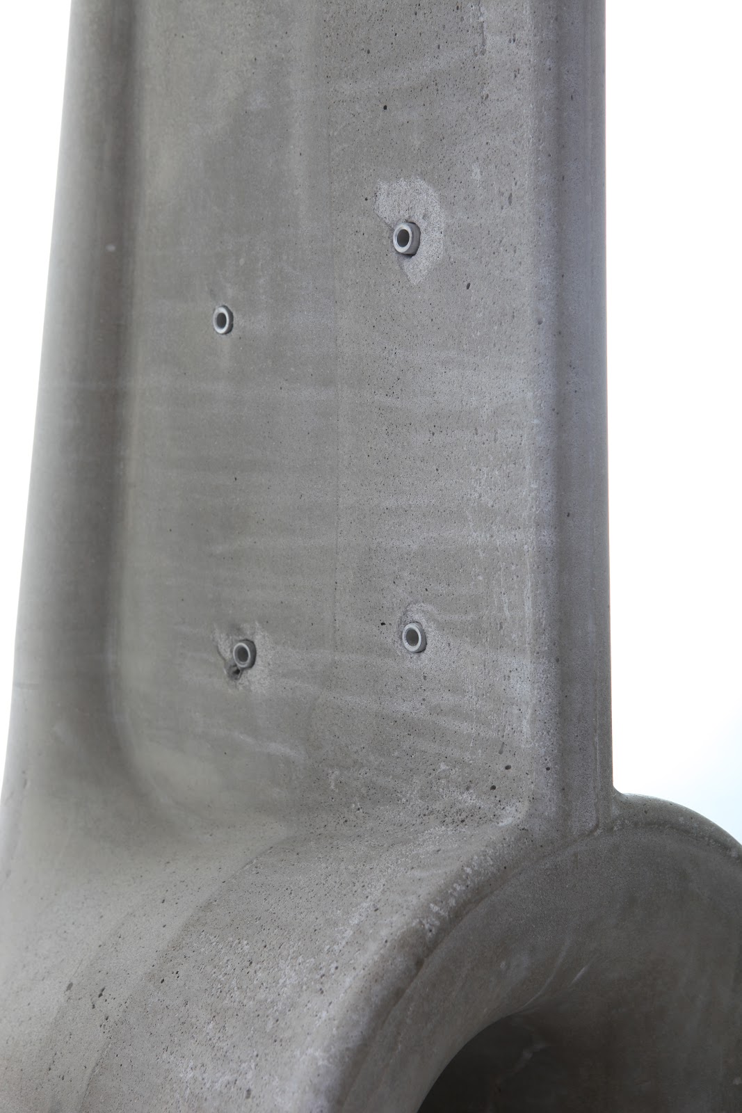
We have already spoken about our interest for concrete and how intriguing this material is for us as it is, probably one of the most controverted materials that has made its journey through the years, from a symbol of urban brutalism, to one of the preferred materials of designers and architects. Today, concrete starts to be more present in our homes, in restaurants or spaces that surround us, yet still, maybe not as much as it should. Its incredible quality offering the possibility of being cast in different shapes, offers the designers new, wide possibilities of creating interesting items that find their application in so many different fields. But who would imagine that this rough material can be ever associated with sound and bring actually a contribution to the sound propagation? Israeli designer Shmuel Linski, has proposed an interesting design of speakers where concrete has a major role- it is that great combination where design meets technology and, with the help of a material with such a strong personality as the one of concrete, the result can only be a great product for concrete and design lovers and audiophiles...

''We often encounter plastic, wood, leather and other basic materials in our homes, but we encounter concrete as a 'hidden' material which is covered by layers of plaster and paint. In my work I tried to give, in addition to great aesthetics, practical reasons for using concrete as a main material in a product. When concrete meets sound, it might distort the sound, because the concrete is very stiff (usually speakers are made of wood or MDF). The speakers might therefore sound strange.

The Horn speaker technology that I used in my project, works just great with the concrete, even without the need of padding the speakers from the inside.

The Driver, which is located in the top part of the speaker, moves the air through a pipe (96cm long) and into a horn shaped mouth in the bottom of the speaker. The weight (56kg) makes the speakers very solid, and turns these speakers into a unique product, invoking a sense of nirvana for concrete lovers and audiophiles.'' Shmuel Linski about his concrete speakers - source: http://www.linskidesign.com/exposed.php


© and source Shmuel Linski http://www.linskidesign.com/exposed.php

                         
© and source Shmuel Linski http://www.linskidesign.com/exposed.php

February 17, 2012

Food vs colors - new perspectives


Who said that playing with food is bad? This old rule is clearly outdated. Much has been made to entertain children and help them to discover all kinds of food in a fun way. But what about adults?

It goes without saying that the sight influences the taste. A well-presented dish will always whet more your appetite. But you may be surprised to learn this: color of food can alter your taste perception. In an article of ScienceDaily (Feb. 12, 2007) entitled “More Than Meets The Tongue: Color Of A Drink Can Fool The Taste Buds Into Thinking It Is Sweeter”,(http://www.sciencedaily.com/releases/2007/02/070212182136.htm) we learn that research showed that color of food (in that case orange juice) tends to make people think there is a difference of taste between two similar drinks - but with different colors -, while they tend to think juices taste the same when color remains the same but that sugar has been added in one of the juices. 

This opens an unlimited field of work for the food industry in terms of use of food colors etc... But it can also lead us to imagine new properties for our daily nutrition. 

Think about it one second. If a wall painted in red is supposed to give strength and energy, should we not garnish our plate of red food when feeling a bit down? Or in yellow when looking for some cheerful feeling? 

The concept of “functional food” has been quite trendy over the last decade. But this supposes to add a new ingredient to the food, whereas working with these intrinsic qualities that are colors would open natural new perspectives? 

So yes, let’s play with food for the fun of colors, regardless of concerns for taste or nutritional issues. Let’s experience the colors and their effects on our mood and appetite. So what do you feel like today: rather red, green or blue?

February 14, 2012

EYE-WEAR- the beauty and chic of a timeless item...

© and source LUNETTES KOLLECTION, web: http://www.lunettes-kollektion.com/


Stylish, distinctive, extravagant, arty- just few words to describe a look created by a pair of glasses…

This useful item has received a lot of attention during the years and became not only a fashion item that creates a look, an image or a brand, but also an interesting challenge for designers all over the world; discovering new, eco-friendly materials, creating new looks, reinterpreting old ones, to finally have a new interesting product that completes and contributes to ones image…

We find eye wear design extremely interesting not to mention the practical aspect when one has to use a pair of glasses all day long. So we decided to start a series of posts with and about eye wear designs that we find interesting.

Today we will speak about the beautiful and inspiring 2012 collection of LUNETTES, an eyewear collection from Berlin handcrafted in Italy. The frames are designed by designer Uta Geyer who has ‘’brought together the timeless forms and styles of vintage frames with the energy and vitality of contemporary Berlin street-life, while still maintaining the tradition of authenticity by producing the eyeglasses by hand in small-batch factories in Italy as they have done since the 50’s and 60’s.’’(LUNETTES KOLLECTION) The frames are produced out of Cellulose Acetate, a natural raw material. ''The exclusive cases made to accompany the LUNETTES KOLLEKTION frames are treasures themselves. Inspired by soap and chocolate boxes of the twenties. Aware of minimizing their carbon footprint and supporting the community, Lunettes prefers using small local firms like the Berlin bookbinder Ernst Ließ, est. 1869, who make the cases by hand.''(LUNETTES KOLLECTION)

The frames of LUNETTES KOLLECTION have somehow the beauty and chic of a timeless item, the simplicity and vitality of contemporary designs. Wearing one of the frames of this collection would definitely make a statement and an outstanding look!


© and source LUNETTES KOLLECTION, web: http://www.lunettes-kollektion.com/

February 10, 2012

”VIVE LE CINEMA!”

 LAB' GUEST COLUMN _ Enrico Campanella _ cinephile                                                                                                       


''Crazy. Meditative. Profound. Dazzling. Daring. These are only few of the various definitions for the 41st International Film Festival Rotterdam which just finished last week.
It started with a Norwegian curling (“King Curling”) to conclude with a Tasmanian tiger (“The Hunter”) and in between for 10 days an apotheosis of Brazilian trashes from ‘70s, Nordic drama, surreal Asian, philosophical Eastern Europe, cynical American, social French and many more.

A melting pot of movies from every party of the world that enchanted the city and cinema fanatics creating an unique atmosphere; for almost two weeks Rotterdam has been not only the centre of international cinema all over the Europe but an immense, temporary café where to meet directors, actors, producers, to exchange ideas, opinions during daily debates and happenings.

However this edition suffered a cut off of the budget, due to financial recession, therefore organisers had to rise up the tickets price in order to maintain high standard in terms of quality of selected movies and collateral events.

The kick off gem was the hilarious “King Curling”, kind of Norwegian version of “The Big Lebowski” where bowling was replaced by the Nordic Olympic sport. The result: a lethal mix of slapstick, a continual double meaning humour up to the final climax: simply brilliant.
After the inaugurating day every spectator had the hard, but absolutely privileged, task to prepare his own list thru all the possible films, trying to set up a schedule according to tastes, interest and time, essential factor in such a full immersion festival. Our choices have been based on determined criteria, like innovation, creativity, in order to combine, possibly, different genres and nationalities.
“Un Vie Meilleure” was the first impeccable call, realistic French drama about migrants, poor people in contemporary western society, vivid performances, in particular of the main character, the super star Guillaume Canet. And then “Weekend” touching British delicate gay love story, against banal prejudice, consumed in two days in the grey Nottingham.

In a festival you should always expect some breaking thru, like “L’Ultimo Terrestre”, satirical, surreal Italian comedy of improbable, odd alien invasions, regenerating a rotten town, with narrow minded, selfish and weak inhabitants.

A superb mention is to be devoted to the retrospective about Peter Von Bagh, legendary Finnish movie maker: his milestone “The Count”, portrait of a real swindler still remains definitely joyful even after decades from first projection.

Probably the palm of most inventive and visionary movie should be assigned to the Italian “La Leggenda di Kaspar Hauser” abstract remake of the original one directed by Werner Herzog. A phenomenal, as usual, Vincent Gallo, here in a double role, sheriff and pusher, stranded in a deserted island where all the rules and conventions seem completely vanished. The appearance of the mysterious, enigmatic Kaspar Hauser could lead to a renaissance but the passivity and inertia of the few persons will compromise everything.


Inertia is also the cardinal concept, aspect of the authentic masterpiece of the festival, the American “The Comedy”, disenchanted depiction of thirty five years old guy in New York. A podgy, rich man living in Manhattan, jobless, killing time with no scope in his life, completely arid in terms of either emotions or feelings. He spends his days from bar to bar, planning jokes, to mock the boredom of his existence. Unable to express any intentions or ideals, he represents magnificently the cynical attitude of these days. Although this loneliness and despair the movie is incredibly enjoyable and remarkable and at least a couple of sequence- the scenes taken place in synagogue and in a cab- can be already considered a must.

The festival had the wonderful capability to enrich the soul of each spectator, to distract him from standard routine, making him ready to new confront toward modern and future frontier of the 21st century cinema, which still is the supreme piece of art. Therefore, once again, let’s praise up the evergreen motto….”VIVE LE CINEMA!”
See you in 2013 for the 42nd edition!!!'' 
(Enrico Campanella-cinephile)
 LAB' GUEST COLUMN _ Enrico Campanella _ cinephile                                                                                                        

Enrico Campanella is a naval architect with passion for cinema. He has seen more than 25 movies at the IFFR this year and many more in the previous years.He has been kind enough to take notes during the festival in order to write for us this great review.We hope you enjoyed it as much as we did!

February 7, 2012

ZEbag®


© and source: http://www.zebag.fr

For those who follow us regularly, you probably noticed our interest for well-designed and multi-function products, with simple and elegant lines. Well, this bottle bag called ZEbag® combines all these qualities. This innovation can be used in two modes - bar and bag - making a storage and carrying solution all in one, so practical, high quality and unique.  


ZEbag® accompanies you to the wine shop and finds its place in your living room or horizontally, as well as vertically, in your kitchen. A product of choice for your next good bottles of wine...


 © and source: http://www.zebag.fr

February 3, 2012

Talking materials...

 fabric made out of thin copper threads_© and source http://www.materialxperience.nl/

Last week we visited the fair Material Xperience 2012 in Rotterdam, following our continuous search for new, inspiring materials for our designs. We found the fair more interesting than last year, a bit smaller though than what we expected, but full of quite interesting materials for architects and designers, some lectures and mostly some useful catalogs with product specifications... We also discovered their wide online database for materials, free registration and membership- http://www.materia.nl/.The website is a bit slow, but we think it's worth taking a look.

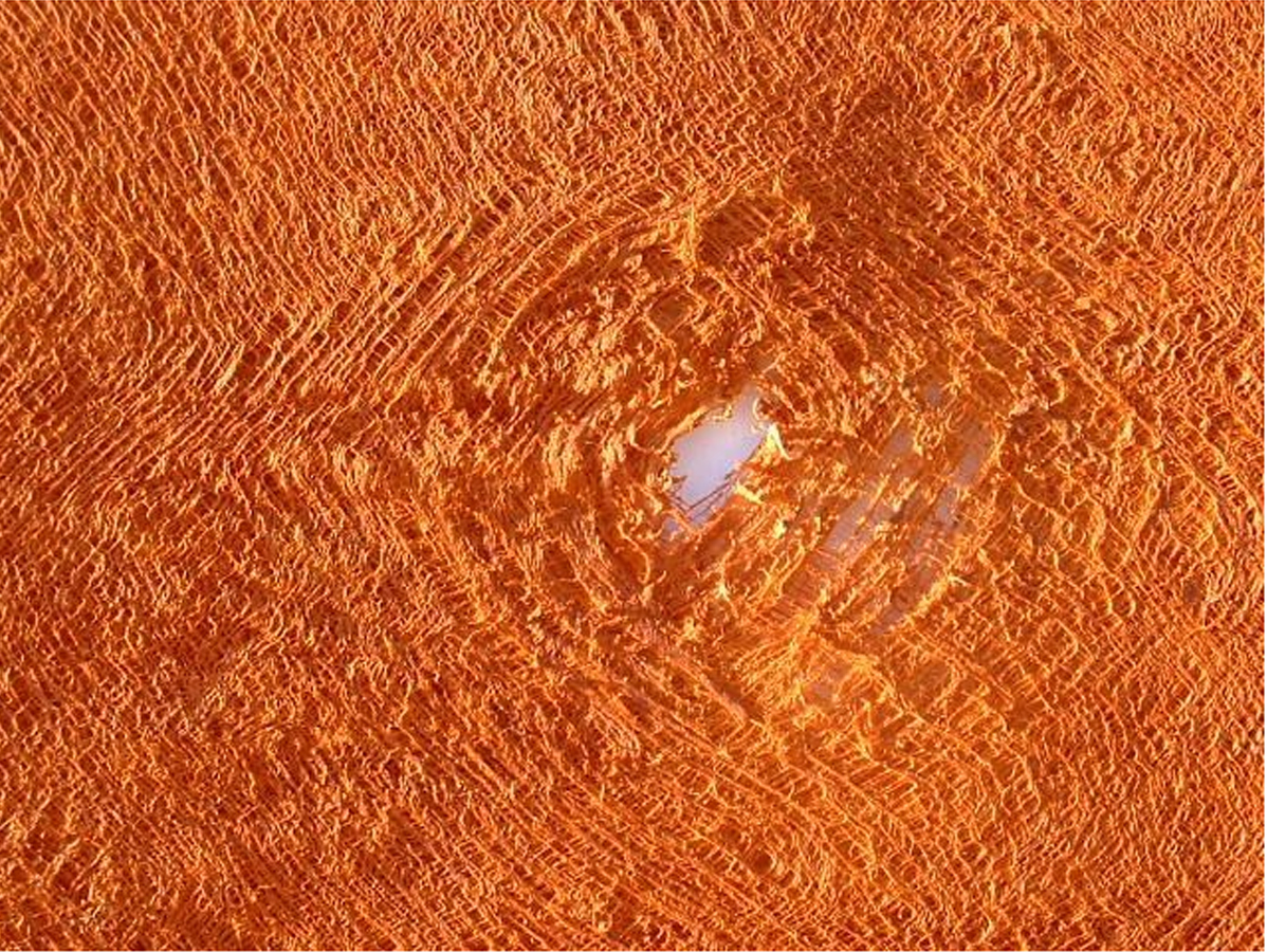
Professional fairs represent an opportunity to discover the latest product innovations and can give new perspectives. Following this visit, we are already on the track for new ideas to implement in our Lab'.So we shall definitely come back soon with updates about our developments. Meanwhile, we thought of sharing with you some materials that caught our attention: the copper fabric(fabric made out of thin copper threads really flexible and strong in the same time, with a really interesting, delicate texture), bark cloth(natural fabric made in Uganda out of trees fibers, is 100% natural, organic and unique since each fabric is made out of the bark of one tree)...
To be continued...
natural fabric made in Uganda out of tree fibers_© and sourcehttp://english.barkcloth.de/html/englisch.html